
Open any creator’s profile and you get only a few seconds to decide. The photo catches your eye first, then the name, then the bio. For a small creator, that bio has to do a lot in very little space: say who you are, say what you make, and give a stranger a reason to stay. There is no budget for a designer, which is why so many small creators have turned to one tiny, free trick: fancy fonts.
These are not fonts you install. They are styled Unicode characters that look like bold, script, gothic or bubble letters, and you can copy and paste them straight into a bio or display name. A tool like the Font Generator turns ordinary words into those styles in seconds. Used well, it makes a small profile look intentional; used badly, it looks messy.
What fancy fonts actually are
Instagram, TikTok and most other apps do not let you pick a font for your bio. There is no bold button and no font menu in the profile editor. Fancy text gets around that limit without breaking any rule, because it is not formatting at all. It is text made from Unicode characters that happen to look like different letter styles.
Unicode is the shared standard that gives every character a code, and alongside ordinary letters it includes mathematical alphabets, circled letters, full-width letters and small capitals. A generator swaps each letter you type for its decorative twin, and the result is still plain text, so it pastes into a bio or display name with nothing to download.
That also explains the limits. Some older phones may show a box instead of a fancy letter, and screen readers may struggle with heavily styled words. Treat fancy fonts as decoration for a few key words, not a replacement for clear writing.
A quick look at the styles small creators use most
| Style | Best for |
|---|---|
| Bold | Names, niche labels and short calls to action |
| Script | Beauty, fashion and lifestyle bios with a soft feel |
| Gothic | Streetwear, music and alternative fashion profiles |
| Bubble | Playful, friendly and gaming-flavoured profiles |
| Monospace | Tech and minimal, professional bios |
| Small caps | Clean, minimal bios that still want a distinct feel |
Why small creators reach for them first
Big creators stand out through recognition. A small creator does not have that advantage yet, so the profile itself has to do the persuading. Fancy fonts help in three quiet ways, and none of them costs anything.
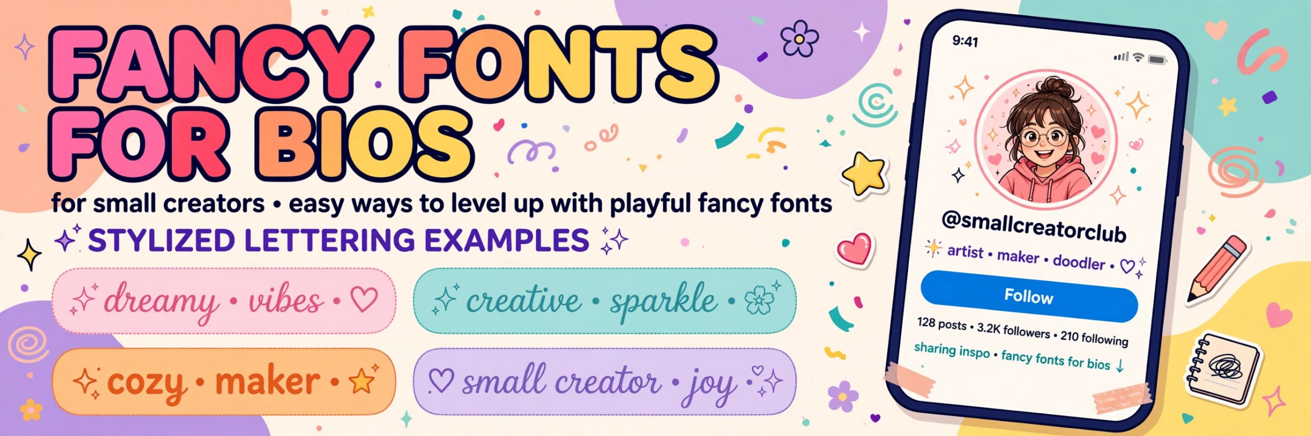
First, they create visual hierarchy. A bio is a short wall of same-sized text, and the eye skips over walls. One bold or script phrase gives the eye somewhere to land: the name or the niche.
Second, they signal personality before a single video is watched. A script style feels warm and personal, a gothic style feels bold, and a monospace style feels precise. Viewers pick up on that tone in a glance.
Third, they are consistent. Using the same style in a display name, a bio headline and captions turns that style into part of an identity over time.
What fancy fonts do not do is just as important. There is no public evidence that styled text improves search ranking or recommendations. Any benefit is visual: a clearer, more memorable first impression that helps a visitor understand you faster.
Where fancy fonts work, and where they do not
The most common mistake is trying to style the wrong field. On Instagram and TikTok, the handle, the part after the at sign, is usually limited to ordinary letters, numbers and a few punctuation marks. Fancy characters are normally rejected there, so styling a handle is a dead end.
What does work, reliably, is the display name and the bio. Those fields accept Unicode text, and that is where visitors actually look. A styled display name, paired with a plain bio explaining the niche in searchable words, is the combination most experienced small creators settle on.
Before committing to a style, test it the way a visitor would see it. Paste it into the bio, save, then open the profile on a different phone if you can, and check both light and dark mode. If any character shows up as a box, pick a simpler style. Readability always beats decoration.
The one-style rule
Ask any creator whose bio looks polished and you will usually find the same habit: one style, used everywhere, and nothing else competing with it. Mixing bold, script, bubble and gothic letters in the same bio does not look creative. It looks noisy, and noise is the opposite of a clear first impression.
Pick the style that already matches your content. A cooking creator filming warm, homely recipes will look more coherent in a soft script than in a heavy gothic style, and a tech reviewer will look more credible in bold or monospace than in bubble letters. Stick with it across the display name and bio headline, leave the rest plain, and let the styled words become your signature.
Bio formulas that actually work
Small creators do not need to reinvent the bio every time. Name, niche, promise: style the name or niche phrase, then write one plain line about what viewers get. Question bio: style a short question your ideal viewer is already asking, then answer it plainly. Call-to-action bio: keep the description plain and style only the final line. Series bio: style the series name and keep the rest plain. Minimal bio: one styled phrase, one plain line, nothing else. In every formula, fancy fonts are the headline, not the whole message.
Mistakes that make a bio look messy
Styling the entire bio is the biggest one. When every word is decorative, nothing stands out, and the bio becomes tiring to read. Screen readers also struggle with fully styled text. Limit styling to a name, a short headline or a brief call to action.
Styling contact details is another trap. Email addresses and other important information should always stay in plain text so they can be copied and read by assistive tools. The same goes for the keywords people might search for, like your niche. Keep those in ordinary letters so the profile stays findable.
Finally, avoid using fancy fonts to imitate someone else. Styling your name to look like a famous creator’s does not make a profile look established. Your own name, in your own consistent style, builds trust far faster.
How to style a bio in a few minutes
Write the bio in plain text first, exactly as you would explain your profile to a friend. Decide on the one phrase that matters most, usually your name or your niche. Generate that phrase in a few styles, read them at normal size, and pick the one you can read instantly.
Paste the styled phrase into the display name or the first line of the bio, keep the explanation plain, and add a single clear next step at the end. Save, view the profile as a visitor, and check both light and dark mode. Revisit the bio whenever your content changes direction.
Frequently asked questions
Do fancy fonts work in a TikTok or Instagram handle?
Usually not. Handles are normally limited to ordinary letters, numbers and punctuation, so fancy characters are rejected there. Use styled text in your display name and bio instead.
Will a fancy font help my profile rank higher in search?
There is no public evidence that styled text improves ranking or recommendations. Its benefit is visual. Keep niche keywords in plain text so they stay searchable.
Will fancy fonts show correctly on every phone?
Most modern phones handle common styles well, but decorative styles can show as boxes on older devices. Test on another phone if you can, and switch to a simpler style if anything looks broken.
Are fancy fonts free to use?
Yes. Generators that convert text into Unicode styles are free to use in a browser, with no download needed. Type, copy the style you like, and paste it into your profile.
Should I style my whole bio?
No. Style a name, a short headline or a brief call to action, and keep the rest plain. A fully styled bio is harder to read and loses the contrast that makes styled words stand out.
Can I use fancy fonts in captions too?
Yes, captions accept styled text, but the same restraint applies. One styled phrase per caption is plenty. If the caption carries the information, plain text reads better.
Final thought
A small creator’s bio is a handshake, not a billboard. Fancy fonts, used sparingly, make that handshake a little more memorable: a clear name, a clear niche, and one styled phrase that tells a visitor, in a glance, what kind of creator you are. Try a style that fits your content with the Font Generator, keep the important details plain and readable, and let your videos turn that first glance into a follow. A styled bio can earn a second look, but it cannot replace consistent posting and genuine engagement.
Use the tool responsibly and within each platform’s rules, and never use styled text to imitate another creator. On4t is not affiliated with or endorsed by TikTok.